There are of course many data sources for SARS CoV-2 and COVID-19. I think it is great that so much epidemiological data is collected in near-real time on such a large scale. Of course, as with many data sets, there can be inaccuracies/discrepancies/idiosyncrasies (hopefully all small). Using a grain of salt is always recommended.
Max Roser’s Our World in Data has a very useful page on data on SARS-Cov-2. Here are two snapshots of the world’s situation:
Sources of data:
A World view from Max Roser’s Our World in Data website
Pages with data on COVID-19 impact as a function of age
CDC’s COVID-19 pandemic planning scenarios, with estimates on key parameters for modeling COVID-19 spread
Explanation of test positivity rates
Estimation of actual number of infections
Several interactive charts, mostly from OutWorldInData’s pages on COVID-19
Data on COVID-19 at schools, U.S.-wide.
A rather thorough vaccine tracking page from Bloomberg, with granular data from the U.S.A., as well as world-wide data, albeit with glaring mistakes, conceptual and beyond, in parts of the reporting, for example in calculating number of vaccinations needed to reach herd immunity, which dismisses ~80M cases (as estimated by the CDC).
the CDC’s COVIDView, with lots of interesting view on current U.S.A. data (albeit the lag in data might be a bit larger than for other sites, it may be a bit cleaner data), including excess mortality, stratification of data by age, sex, race/ethnicity, and co-tracking of influenza, which might become more and more relevant during Fall and Winter ’20-’21.
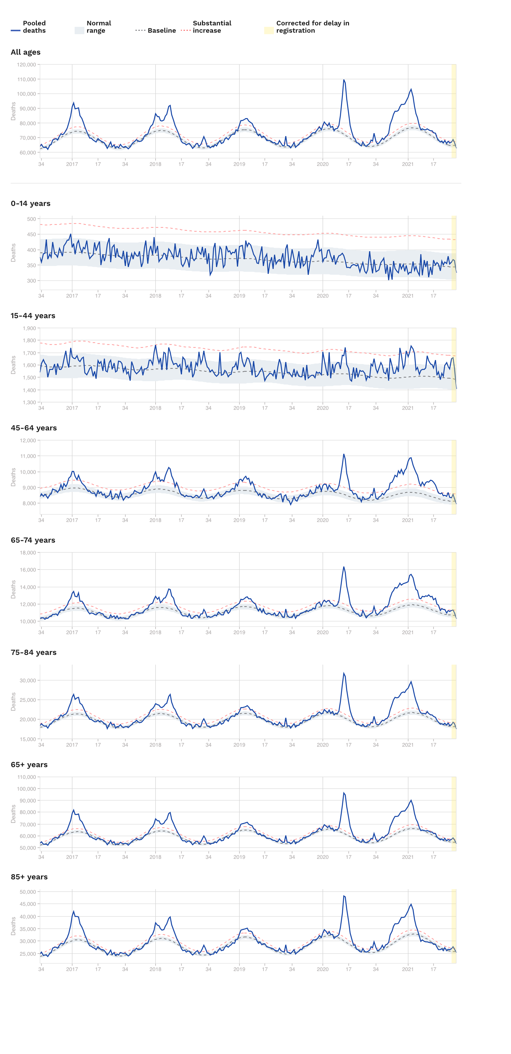
For worldwide data on excess mortality wrapped in one place, a useful start is Max Roser’s OurWorldInData pages (one of my favourite web sites) could be this OurWorldInData page on excess mortality page, and their interactive chart, an example of which is right below – with an extra encouragement to go the OurWorldInData page just linked above, as they provide clear and detailed explanations of the data (the definition and estimation of excess mortality is not trivial), as well as other interactive tables, for example with excess death by age groups, which is quite informative. The data lags by a few or even several weeks, so the rightmost portions of the plots (~1-3wks) may be either missing or be subject to updates. I created two graphs, for ages 65 and up, and for ages 15-64, note the two graphs are on different vertical scales. I think the evolution of this data is and will stay important for many, many months to come.
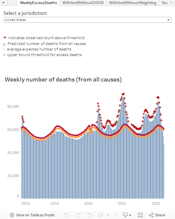
The CDC’s page on Excess Deaths Associated with COVID-19 is also useful in similar respects, with similar caveats (estimates are mortality, and excess thereof, are…estimates; data lags by about 1-3 weeks, etc…); a summary here to the right.
Also, EuroMOMO tracks excess deaths from 24 European countries, both across all age groups, and stratified. It shows rather clearly the dramatic difference across age groups. Unfortunately the graph on the side here is not an interactive embedding of their graph, so it may not be the most up-to-date info, for which please use the link at the beginning of this bullet point.
The main section on COVID-19 at OurWorldInData has quite a lot of material, often organized in highly interactive and informative charts. I like that one can choose quantities of interest per unit of population (in some unit). While absolute numbers are of course important (and it makes us realize the absolute size of the human toll), most epidemiological phenomena are driven by quantities per unit population, not absolute quantities. While this is obvious (1000 cases in a country of 10,000,000 people is not the same, for most epidemiological (and beyond) purposes, as 1000 cases in a country of 300,000,000 people), many (even popular, like the one from JHU) websites continue to only report/visualize absolute numbers, which are terrible for comparing across countries with very different population size. Of course it is not the case that everything scales by units of population (e.g. scaling up testing may be harder in large countries vs. small countries, for example if materials availability is a relatively hard constraint – for example some tiny countries have a number of tests larger than the whole population); also scaling by population is likely not optimal for all modeling purposes, e.g. population density almost certainly matters in view of virus spreading, distribution of population age, or co-morbities, matters a lot in view of predicting number of critical cases per infection, etc…
In the plot below there are confirmed cases per unit of population (1,000,000 people here), with aligned outbreaks, for many different countries (you may interactively change that selection). Moreover, the trajectory of confirmed cases is colored, at each time point, by the positive rate. A high positive rate may be caused by constraints on testing capacity, possibly indicating there is a significant amount of non-confirmed cases; however this is only a possibility – as discussed in the link above explanation of test positivity rates. Note you may switch to log scale in the vertical axis, which may be helpful depending on the countries selected (yes, even quantities normalized by population size have differences of several orders of magnitude!). The very latest available data is at OurWorldInData
Here is another interactive chart, with deaths, and non-aligned outbreaks, different countries, and log scale. Again, many options (which countries to show, log vs. natural scale, etc…) can be changed interactively. If you move your pointer near the graphs you can see actual values at any point in time.
The COVID Tracking Project (U.S.A. data only); in particular for the careful tracking of data from long-term care facilities – the title of which page, as of the time I am writing this is: “Less than 1% of America’s population lives in long-term care facilities, but as of October 22, 2020, this tiny fraction of the country accounts for 41% of US COVID-19 deaths.“. The data there is stratified by large geographical regions (in the U.S.A.), and state, and also before/after June (note: given that the wave of cases occurred at different times in different geographical regions, a display of percentages, stratified in time, or with time aligned to the start of the outbreak, as in other chart below, would make that for interesting additional display options).
This measures how skewed towards the older (and, likely, with more co-morbidities) part of population the number of critical cases and deaths has been. However grim the numbers are, this can perhaps be interpreted as good news, as efforts focused to protect this relatively smaller high-risk part of the population, while not easy, would lead to outsized rewards. [This is of course similar to other diseases – e.g. the flu, albeit for the flu smaller kids are also at higher risk of severe complications compared to the rest of the population (which is why vaccination rates are higher for higher-risk groups).] This page on Wikipedia on COVID in Sweden reports that 3.6% of all fatalities are for people less than 59yrs old, which constitutes 70% of the population (I did find the source of data referenced therein, which also contains rather detailed co-morbity statistics, but not processed it myself in order to confirm this).
the CDC’s COVID-19 Pandemic Planning Scenarios (again U.S.A. only, albeit some of the estimates therein are of global interest), in particular containing the latest CDC estimates of important epidemiological parameters such as infection fatality ratio (IFR, stratified by age, showing the disparity between, say the IFR for 70+ years old and 50- years old; of course co-morbidities are very important factors besides age, see for example, see for example here), percentage of asymptomatic cases, median time to symptoms onset, etc…
I like their clear explanation of what test positivity rates are (and are not) with nice visual explanations; I am befuddled by the conclusions that I have heard some people (including colleagues who know a thing or two about numbers) drawing from the dynamics of this metric.
On estimating the number of actual number of infections (not only confirmed cases), especially in the early part of the outbreak under testing-availability constraints: see for example here. This is a difficult problem, as randomized tests for the presence of antibodies and, perhaps even more importantly, T-cells (also here, here,…), are very few at this point (Sep. ’20).
A discussion@OurWorldInData on COVID-19 mortality. I am astounded by the number of sites and people fixating on the Case Fatality Ratio, which is the ratio between deaths and confirmed (by test) cases, which is variable and dependent on so many factors (such as age distribution of the population affected and availability of testing), and it is very much time-dependent (because of the dependencies of the time-varying factors just mentioned, but also because of improvements in care). Beware of those who leave “confirmed” out, or pretend this quantity is constant in time (e.g. here), or relate it too strictly to risk of death.
OurWorldInData’s statement at the web page above: “What we want to know isn’t the case fatality rate: it’s the infection fatality rate“, which is the ratio between deaths and total infected people (whether or not confirmed by a test). This denominator is not known, the degree of uncertainty with which it is unknown depends on many factors, and is subject to much work (and perhaps too little measuring so far, see point above).
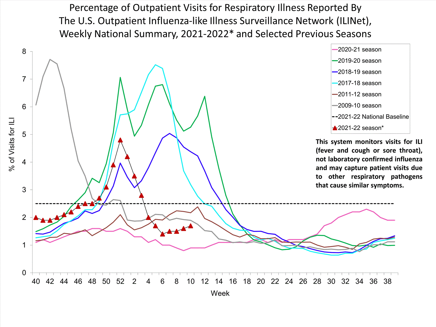
CDC flu tracker for the U.S., which, rather predictably (at least, according to my lower-school daughter), is behaving in line with what happened in the southern hemisphere. I have no idea how Norio Sugaya, a WHO member on the influenza committee, can say “This is an extremely puzzling phenomenon. We’re in a historic, unbelievable situation,” according to this WSJ article. See the full CDC page on FLU tracking here, whence the image below was taken, as well as CDC page of flu vaccine effectiveness, in particular reporting that effectiveness could not evaluated for the 2020-2021 season due to lack of cases, and estimated efficacy for the 2021-2022 is around an unfortunate 15%.